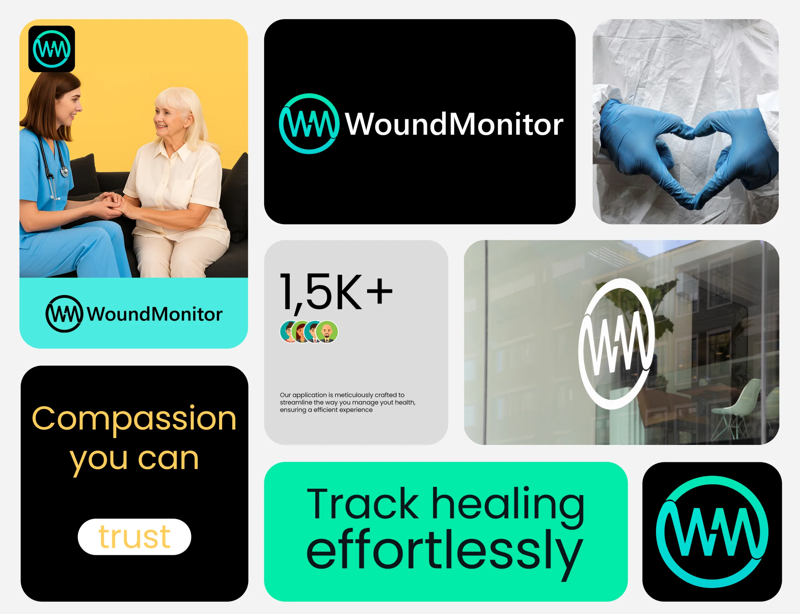
Wound Monitor
2020
Client
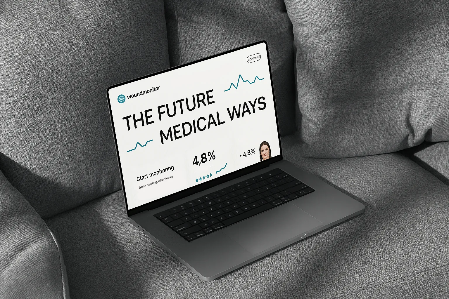
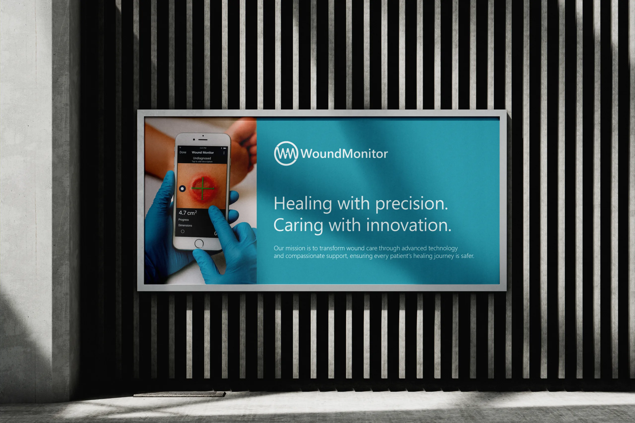
Real-time wound monitoring and healing insights

The Challenge
The goal for WoundMonitor was to design a scalable, clinically-aligned brand identity for a cutting-edge digital health solution dedicated to real-time wound tracking. The challenge lay in translating complex medical functionality into a visual language that is clear, intuitive, and trustworthy.
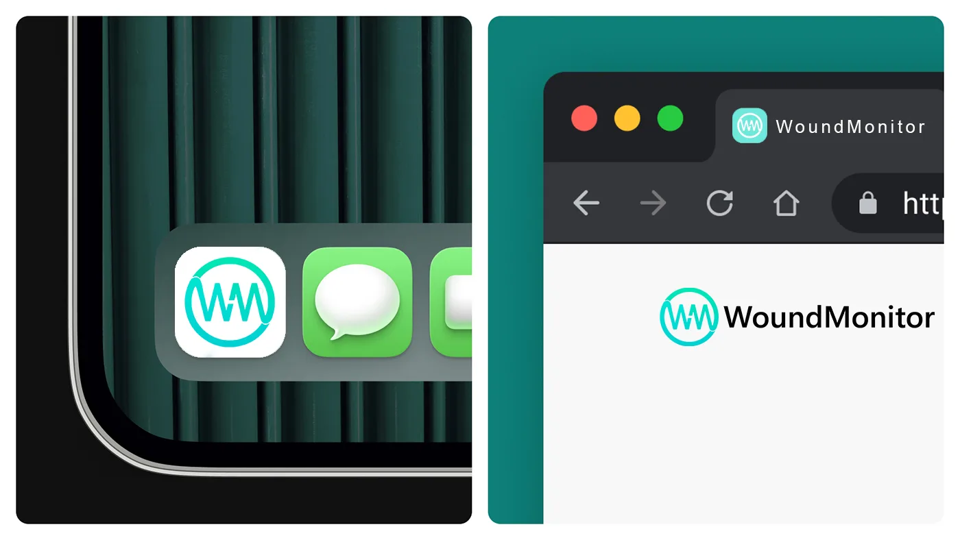
The resulting brand needed to resonate equally with healthcare professionals, institutional stakeholders, and patients, while adapting seamlessly across mobile interfaces, medical reports, and marketing assets.
Vital Simplicity, Bold Identity
Logo Concept
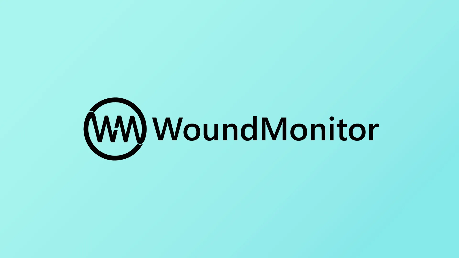
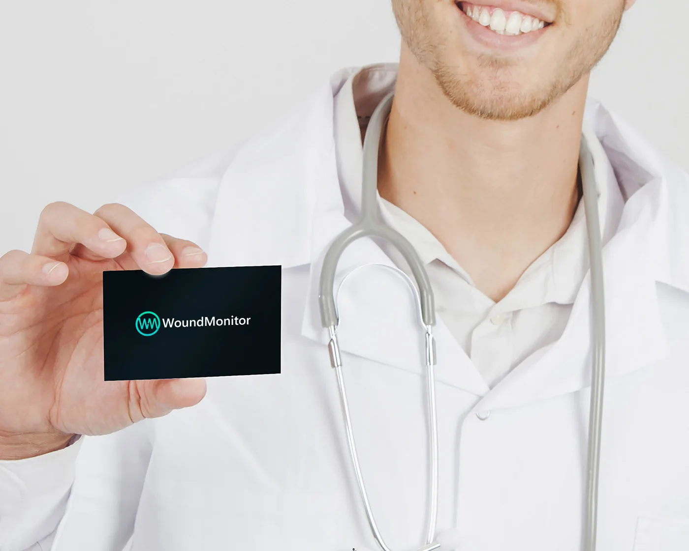
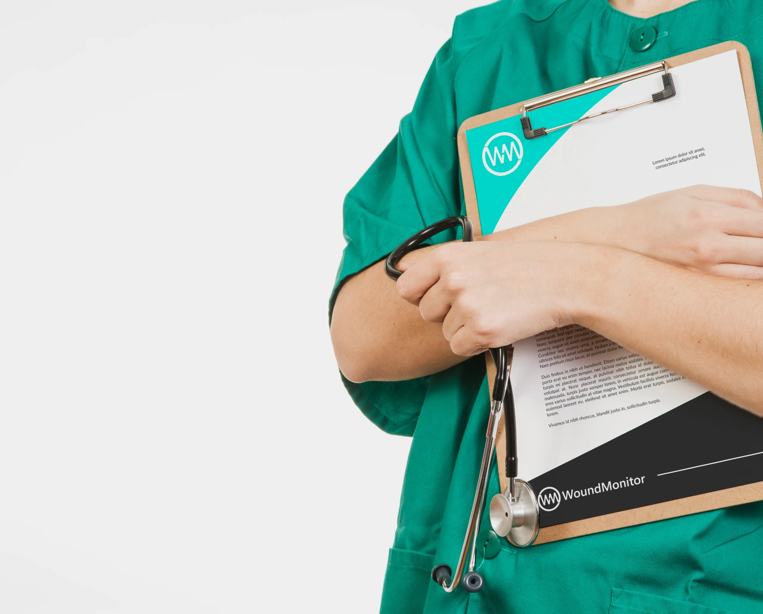
At the core of WoundMonitor’s visual identity is a symbol as intentional as the solution it represents: the seamless fusion of the initials “W” and “M” into the form of a vital sign waveform. This not only reflects the platform’s focus on real-time monitoring but also subtly integrates a gap within the lines - a visual metaphor for a wound: raw, visible, and real.
The enclosing circle reinforces the brand’s commitment to continuous care, protection, and medical precision.
100%
Clinically aligned design
100%
Custom-built visual identity
AI-Powered Healing, Human-Centered Care.
CARE YOU CAN FEEL
Where empathy meets technology
Built with care, trusted by professionals.